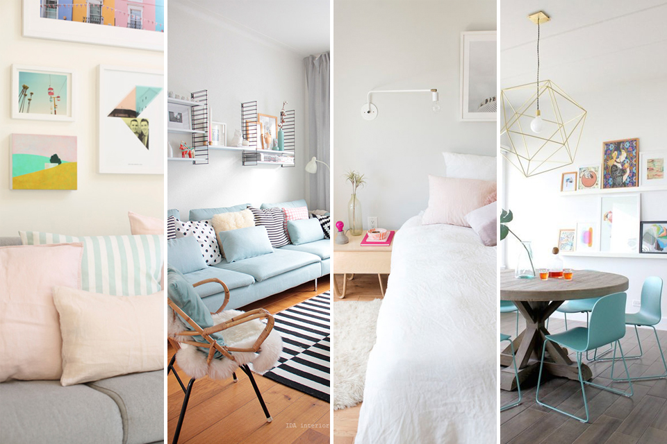
How to Incorporate Pastels in Your Décor
So the sun is shining, the flowers are beginning to bloom and the buds are finally making their appearance in the trees. With temperatures rising, it may be easy to shove those winter boots and coats to the back of the closet but what about our homes? Creating a spring look without having to fully redecorate isn’t difficult and one of the easiest ways to bring spring into our homes is by welcoming in the palette of the season. Soft pastels create a wonderful airy look that lifts our moods and can be easily blended with our current tastes.
So with that in mind, here are a few tips to incorporating the colours of Spring into your home.
Combine them with brights
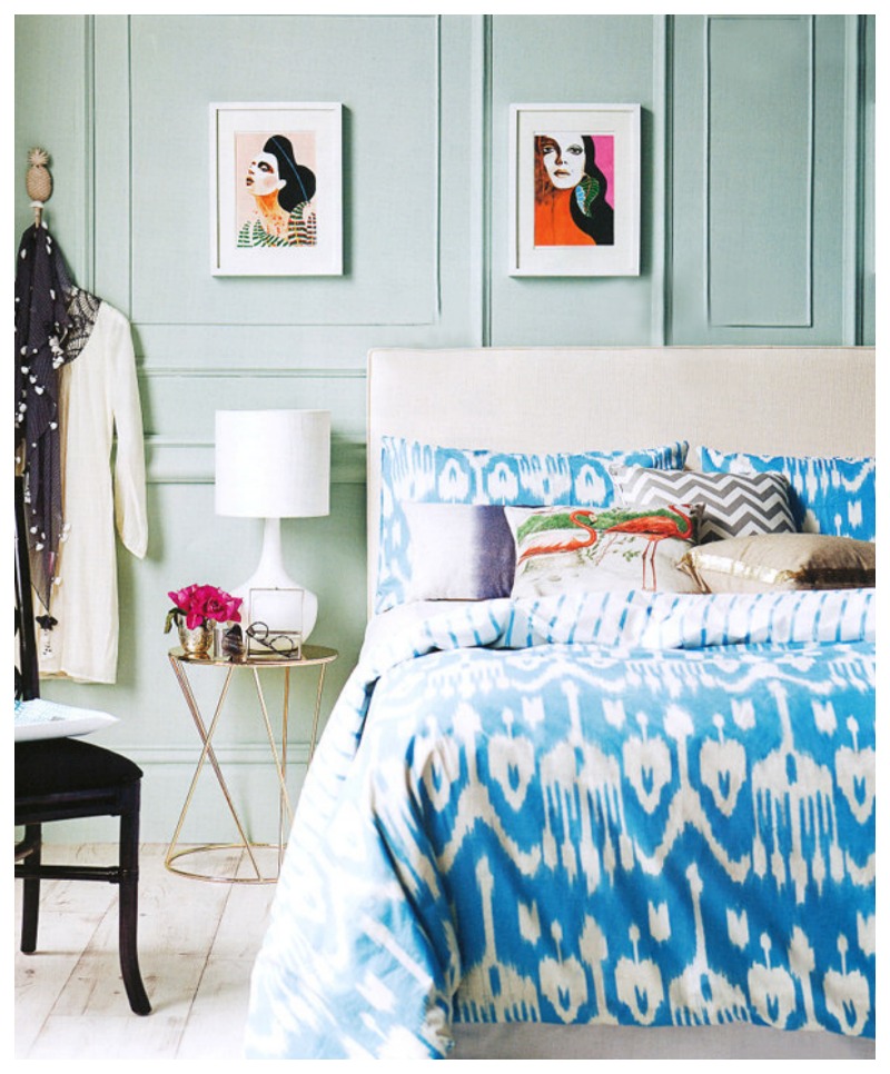
A wall of soft green combined with bold blue bedding may not be our first inclination but when used with cushions that complement the colour scheme, it’s hard to ignore how well this works. Bring in bright colours through artwork and textiles and ensure there is a balanced mix for the most successful eclectic pairings.
Lift a neutral palette
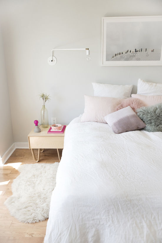
For a room that uses mostly neutrals, consider bringing a hint of colour by way of pastel cushions and accessories. The room will continue to feel calm and airy but with that touch of softness, the palette is quietly uplifted without overwhelming the senses.
Brighten a dining room scheme
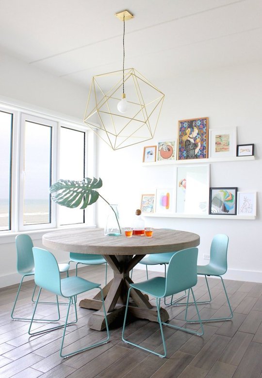
Consider painting small furnishings in a cheery hue to really make a statement. Here, pale blue chairs add a charming touch to a modern space. Consider if the chairs were white, it just wouldn’t have the same impact, would it? Small touches like this are fairly easy to replicate with primer and spray paint and can be done in a single weekend.
Embrace blush pink walls
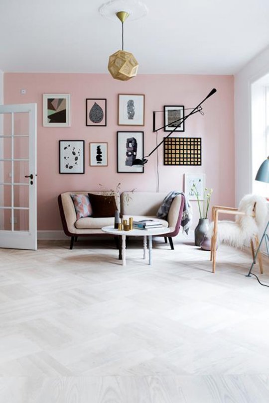
The palest pink is no longer reserved for nurseries and was named one of Pantone’s Colours of the Year for 2016. Using blush pink in combination with black gives it a bit of edge and makes it easy to live with. It also combines beautifully with warm metallics like brass and copper to add a subtle glow.
Combine with black and white
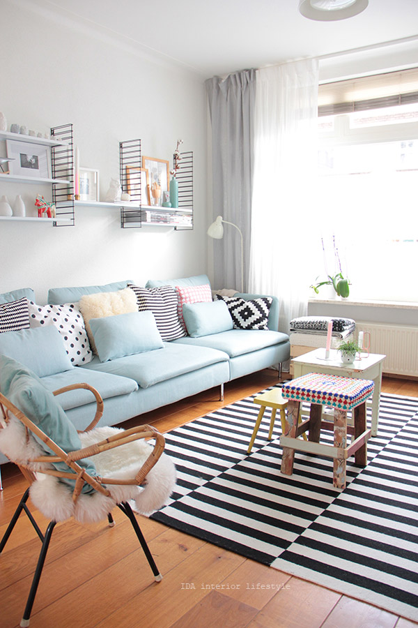
Soft colours can go too sugary very quickly so the easiest way to maximise their impact is by combining them with monochromes. Black and white will balance out the softness of pastel colours and create a wonderful contrast that’s both inviting as well as exciting.
Mix and Match
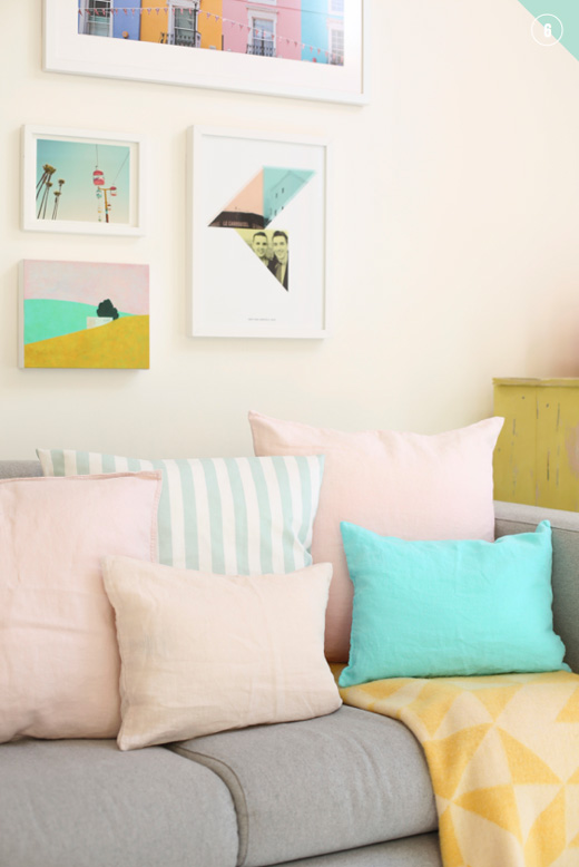
Combine various pastels with each other for a fun liveable look that’s easy to achieve. Using art as the basis for your palette, tie in plain and patterned pastels of similar saturation for easy going style.
A few choice touches
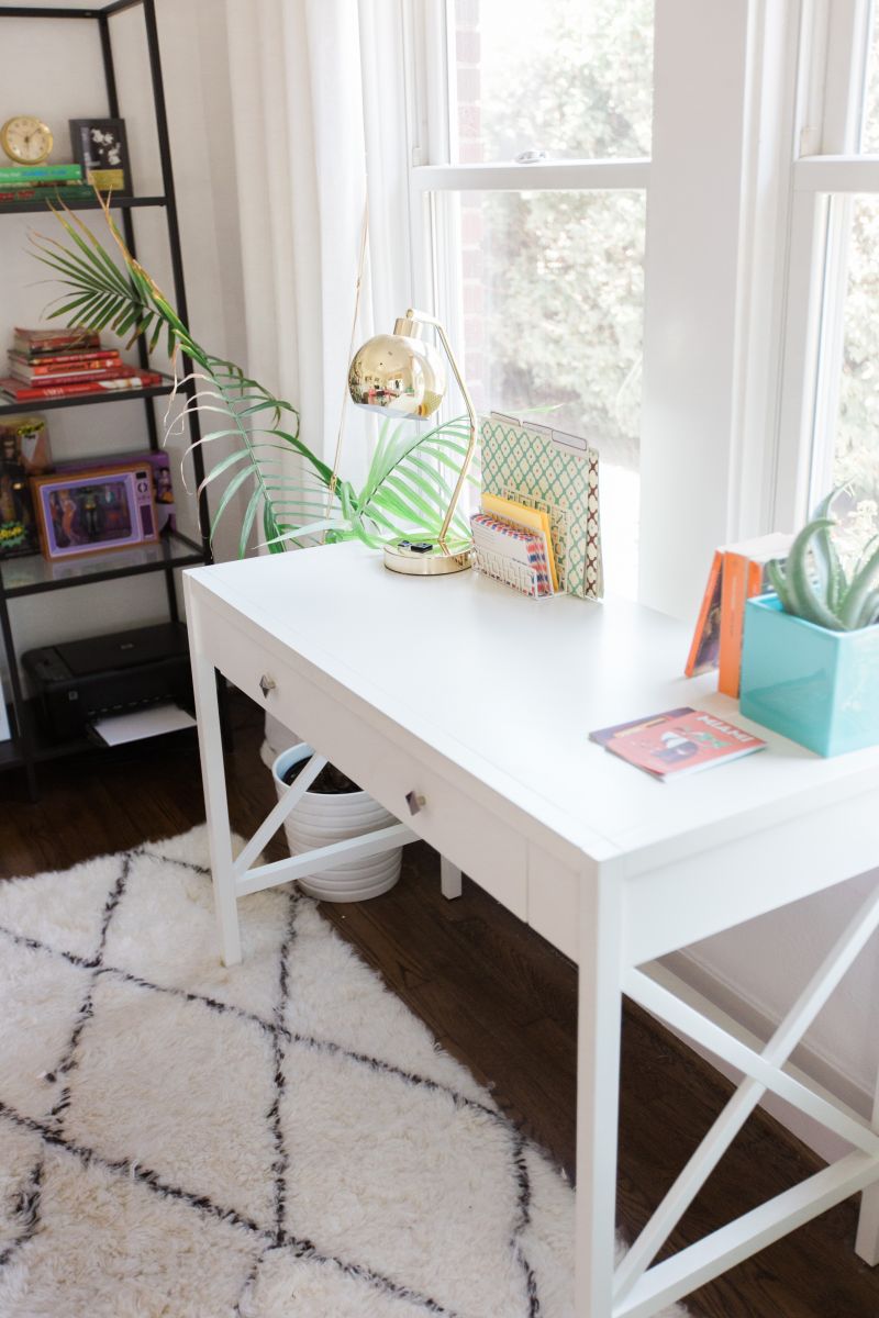
Finally, the easiest way to incorporate a few pastels is with smaller accessories. Here, a plain white desk is given an injection of spring hues with accents in spring colours. Just a few simple touches are all that’s necessary for any area of your home to look ready for Spring.
Remember, our oak furniture ranges work beautifully with pastels. Check out our Rustic Oak Range which pairs perfectly with the soft colours of Spring and brings a little bit of an organic touch to this colour palette.
Image Sources: Real Living Australia via Bed Nest / Ivan Solls for Design Love Fest / Apartment Therapy / Bolig Liv / Ida Interior Lifestyle / Bright Bazaar / Ever and Anon Photography for The EveryGirl